For the basics of scanning, see the previous how-I. Colour scans get a separate chapter, because when colour is involved, there are two ways to scan. For the monochrome scan, ie. one colour on white, scan and straighten the image as explained in the previous how-I, and edit as shown under the first header. For a multicoloured scan, the procedure is slightly different because the resizing that is done for B/W and monochrome scans may change the colours.
The program used in this how-I is Paint Shop Pro 7 under a DOS-based Windows. As a Linux convert I now use GIMP, which has similar functions and filters.
To continue where the previous page left off: 99% of the work in scanning doujinshi is scanning B/W pages, but doujinshi have the odd coloured page, either full-colour or, more frequently, monochrome: coloured paper with black printing on it, or white paper printed in one colour.
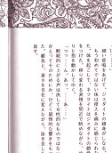
An example of monochrome printing, in this case in gloomy red.
If the paper is white and the print coloured, I scan, rotate and grayscale the monochrome image, clean it up as I would a B/W image, then colourize it to the original colour of the ink. This makes a more pure scan (that can more easily be reduced to 8-bit colour) than if I'd kept the colours it was scanned in, because in translating perceived colours to image pixels, scanners tend to err and introduce extra colours. So a red-on-white original might produce a scan with yellow pixels. Colourizing will, however, also tint shadows, as shown in the image above.
When the paper is coloured, I have the choice of retaining the colour, making it a colour scan (which increases the filesize enormously, unless I can reduce the colour depth to 8-bit without visible quality loss), or filtering the colour out and putting it back in later. A relatively trouble-free of un-colouring such a scan is to get rid of the colour using layers and blend ranges, applying the resultant B/W picture as a mask and pasting a masked black layer on top of an image that has been flood-filled with the background colour.
As an introduction to the topic of blend ranges, I'm going to explain how I made scans of manageable filesize from a doujin printed on pastel blue paper. The initial full-colour scans from the DJ were huge files, partly because of the colour depth and partly because the blue background wasn't uniform, but murky and mottled with grey. In the lossless compression of the PNG format, every colour change between one pixel and the next means a larger file, so I want the background to be as evenly coloured as possible. This also applies to B/W scans, where the Highlight/Midtones/Shadow adjustment was used to whiten the greyish background. That adjustment won't have the same effect in a coloured image, and greyscaling it - changing the pastel blue to its equivalent hue of grey - leaves me with a background so dark that adjusting the highlights back to white will bleach all detail out of the image. I specifically need to remove the colour before I clean up the scan.
After straightening and cropping the blue page in the same way as normal B/W pages, I make sure that my image is a layer, so I can add a new raster layer, flood-fill it with white and drag it underneath. (This method only uses raster layers, no adjustment layers.) The white layer is now hidden under the scan. Now I open the layer properties of the scan, choose the Blend range tab, pick the Blue channel as opposed to the white one, and move the upper right triangle in the topmost slider bar from 255 to 144. This means that in this layer, any RGB pixels with a B value of higher than 144 will become see-through, and the white layer underneath will shine through.
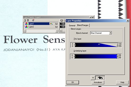
The blue filtered out, the left half showing the background colour
without the blend range adjustment.
Using "Merge visible" joins the two in a new layer. (This must be done before Greyscale is used, or the image becomes greyed and muddy!) The background is so pale that Highlight/Midtones/Shadow adjustment isn't needed, and removing all colour with Greyscale gets rid of the blue cast. (When the white background isn't quite white, but has patches of darker shades - like 254/254/253, barely distinguishable from pure white - I use HMS with Highlight at 99 to clear those up.) The layer can now be resized, and any murk around the edges whited out. When it's as clean as possible, it can be sharpened with the Unsharp mask and cut to its final size with Canvas size. If I want to keep the page as a B/W scan, it is now finished.
However, I want to restore the pastel blue background. To do this, I first create a colour which is as close as possible to the real paper colour and either flood-fill a small square with it to save for future use, or add it to the Paint Shop Pro feature "custom colours". Then, I make a mask from the existing B/W image. What I want is for the anti-aliased grey edges of the lines to become semi-transparent and blend with the colour underneath.
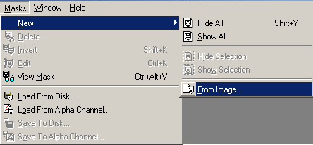
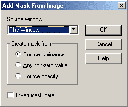
Making a mask from the image.
The image will now look milkier than before, because the black parts of the mask are obscuring the black lines. So I'll invert the mask.
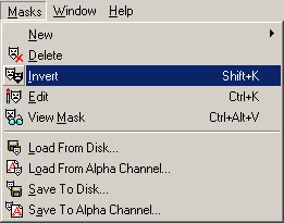
The mask is made into its negative.
Now the lines are clearer, but still not as clear as I want them. The lines of the image are now preserved in the mask, so I'm going to flood-fill the actual image with black, using the match mode "None" so that I'll end up with a pitch-black rectangle. At least, that's what I would see if the mask were disabled, but instead I see very crisp black lines against a transparent background. Now all I have to do is make a new raster layer, flood-fill it with the pastel blue background colour, drag it under the transparent layer and merge the two. A colour count shows that the number of colours is less than 256, so I can reduce the colour depth to 8-bit with no loss of image information whatsoever.
The very large graphic below shows the whole process: 1. the grainy original scan; 2. most colour removed by setting the blend range; 3. the layers merged, greyscaled, resized and unsharped; 4. a mask made of this image, and inverted; 5. the image itself recoloured black, the mask preserving the lines of the original; 6. finally, a smooth blue layer added underneath.
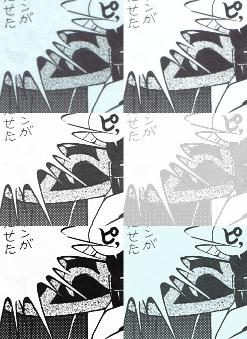
Processing a scan with coloured background, in six steps.
| Back to index |
This was going to show the problem of a yellow cast and loss of detail when scanning at high resolution and then shrinking, but the guilty scanner (a Lexmark) is hooked to a computer that has been out of order for a long time, and it is on the harddisk of this out-of-order computer that the evidence is kept. So I thought I'd rescan using a newer Canon scanner, only to find that the problem no longer occurs. I'll describe it anyway, though.
On the old scanner, colour scans would not only be paler than the original, but more yellowish. This is because I scanned at high resolution, using a moire filter (most scanners have this kind of despeckling option, it's usually called something like "scan magazine") and then shrinking the image. Scanning at high resolution and then cleaning up and shrinking the image works very well for preserving detail in B/W scans, where the idea is to separate the black from the white. It doesn't work at all for full-colour scans, where there's not really any cleaning-up to do; at most, there's colour correction and the unsharp filter to freshen up colours if the scanner got it wrong. What happened was that, due to a shift from red to green, pinks became less pink and stood out less from a yellowish background; in other words, detail was lost. I spent a lot of time fussing with colour correction and splitting the scan into CMYK and RGB channels before finally accepting that those details were lost forever and no amount of editing was going to bring them back. The only way to stop loss of detail was to scan coloured images, like doujinshi covers, at a low resolution, so as not to have to shrink them, and preferably without moire filter.
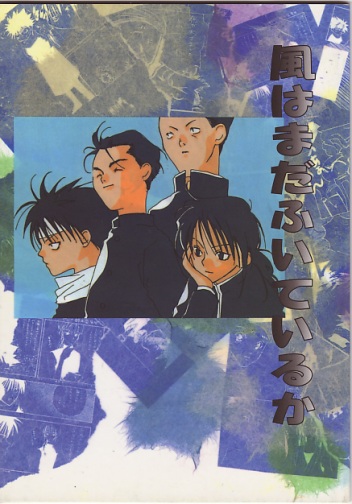
The scans showing the blurred-out detail in the face of a character on the cover are inaccessible, being on a dead computer, so I scanned the same cover again at 300 dpi and 75 dpi, with and without despeckling, and shrunk the 75 dpi versions a little, and the 300 dpi versions a lot, expecting the detail to have vanished from the 300 dpi versions. It didn't, making me very pleased with the Canon scanner, and showing that with this scanner, despeckling is an absolute necessity, unless I scan big and then shrink. The images are pretty big, but they are the size that a scanned DJ image would normally be: as large as possible while still fitting within the screen. They're even on the small side for a DJ image, because the DJ itself was half the size of a normal DJ.
The first two images are the cover scanned at 300 dpi and then shrunk to about a fifth of the original size, and a part of the cover before it was shrunk, showing what the scan is like without despeckling filter. It's clear that when this huge image is shrunk, the speckles are automatically lost when all the pixels are squeezed together and their colours averaged, which mimics how the human eye works. The details that were lost on the other scanner are the lighter smudges in the shaded part of the cheek.
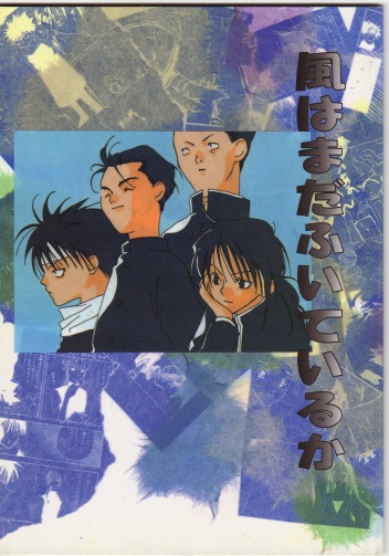

Again without despeckling filter, but now at 75 dpi and then shrunk only slightly. On the older scanner, this would have been the better picture. On the Canon, a misguided attempt to still capture the many little points of colour in a printed image produces a horribly stripy picture.

Another scan with despeckle filter (option "Color (Magazine)" in the CanoScan Toolbox) at 300 dpi, the same piece cut out of the unshrunk scan, and the scan after shrinking. No loss of details. Looks smooth at any size.
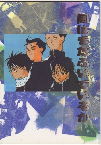
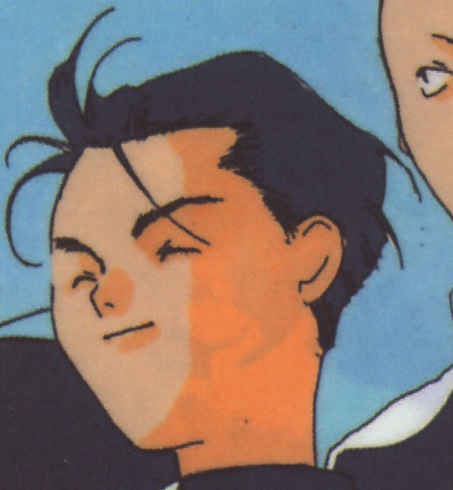
At 75 dpi, slight shrinking. Clearly, also looks smooth at any resolution. (Although there are slight differences visible in the hindmost character's neck and collar, when both images are magnified. The second scan, not having been shrunk so much, has less smoothing of the edges, which looks better in some places and worse in others.)
I guess this is a lesson to never economize on scanners. However, although this scanner reproduced the colours faithfully, here's what to do if the colours of a scanned image look a bit washed-out compared to the original. Darkening the image is not an option, as this will turn whites to greys and cause loss of detail in dark areas.
My method uses layers - present in Paint Shop Pro version 5 and up - and preferably adjustment layers - present in Paint Shop Pro 7. When the scan is straightened, cropped and at its final size, I'm going to add an adjustment layer of the type "Hue-Saturation-Lightness". I'm not even sure whether the type of layer matters, since I'm not going to change the HSL settings. Instead, I'll change the layer blend type from "Normal" to "Multiply". Whoa, now the image is a lot darker; but the Multiply method ensures that white stays white. Since the image is now too dark, I'm going to move the adjustment layer's transparency slide to the left until the colour enhancement matches the physical doujin cover's colours as closely as possible. In practice, the adjustment layer will be almost completely transparent. Then I merge the layers to transfer the improvement to the scanned image. In Paint Shop Pro 5, a similar result can be had by making a new layer, flood-filling it black, setting the blend type to "Burn" and moving the layer's transparency slider until the colours are right; like the solution with the adjustment layer, this darkens colours based on their original value, so white stays white.

The scanned image, and a rectangle in the middle showing the darkening
Multiply effect.
This works when all colours are uniformly altered; not when, as with the yellow cast, one colour has been leached out. Editing colour on the computer is always tricky, because the absolute colour of printed paper is transferred via the scanner to a digital image of which the colour values are absolute, but the visible colours relative, affected by the monitor and display settings. What appears as rich purple on my monitor may appear as dull purple on another PC, and as mauve on a Mac. Professional graphic artists calibrate their monitor and scanner to produce a digital image that will reproduce the original colours as faithfully as possible. I can't quite be bothered to do that, but I realize that when comparing the doujin cover to the image on the monitor, any colour improvements I make will only look that way to me; on someone else's monitor, the result may look worse instead of better.